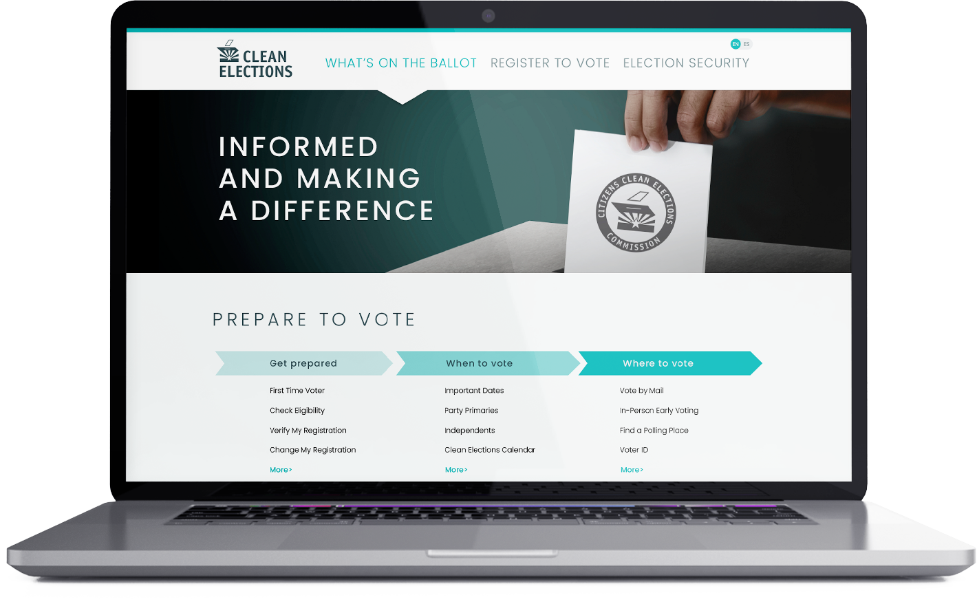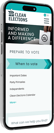
I developed a concept redesign for Clean Elections with one goal: move voters from confusion to confident action. My approach began with a clear cover that surfaced five core tasks up front: register, check status, request a ballot, understand ID, and find where to vote. I mapped user flows to keep each task on a single path with one primary CTA, using plain language, progressive disclosure, and real-time validation to reduce friction. Accessibility and equity were built in from the start with WCAG AA choices, bilingual parity in English and Spanish, and local personalization through address and county lookup that auto-applied deadlines and locations. The content strategy prioritized trust, with concise explanations, glossary popovers, and in-context source citations. The result was a proposal designed to raise clarity and completion without adding cognitive load.
Know Your Election!
Design strategy: bilingual toggle, address and ZIP lookup, deadline timeline, and county modules with clear information architecture, primary CTAs, and source citations that build credibility.

Learn
Flows That Convert
Streamlined user flows reduce abandonment with short forms, progressive disclosure, and real-time validation. Local info powers polling place and drop box maps, early voting windows, and ballot tracking links. English and Spanish maintain content parity, and clear confirmations close every task with confidence.
Act
From Question to Next Step
The cover introduces five tasks up front: register, check registration, request a ballot, understand ID, and find where to vote. Content uses plain language with quick glossary popovers and links to statutes. Each section ends with one clear action so visitors always know the next step.