
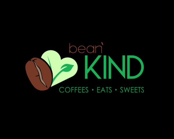
What started as a struggling café with a forgettable logo turned into a local favorite with heart. We renamed it Kind Bean, built a warm, dessert-inspired identity, and gave them a logo people actually wanted on cups, shirts, and stickers. The brand became a catalyst for growth—and a big reason the business was eventually sold, with plans to expand.
Color & material
The palette started with rich chocolate brown, a nod to both coffee and kindness. A deep raspberry red heart topped the logo’s “i” and became the center of the brand: warm, handmade, and immediately recognizable. From aprons to dessert tags, every material choice echoed that cozy, thoughtful vibe. The result wasn’t just a look, it was a feeling.
Warm Chocolate
#402020
Bright Berry Red
#ce0e2d
Almost White
#f7f7f7

Brewing a Brand People Love
We gave Kind Bean more than a new look, we gave it a soul. The custom logo and hand-drawn heart icon became the centerpiece of a brand that felt warm, local, and full of care. From t-shirts and coffee cups to dessert tags and storefront signage, every element was designed to reflect the inviting, health-conscious vibe of the café. It wasn’t just branding, it felt like home.
Taylor didn’t just give us a great logo, he gave us a brand people felt connected to. Customers loved it, and honestly, it played a big role in helping us grow and eventually sell the café. It was the best investment we made.”
Clay & JenOwners
